Saugeen Shores is refining its Town logo, but only slightly after pushback from council.
Back in Late January, an initial brand and logo refresh was presented by staff in a report to council. The proposed new logo kept the usual birds, but not the waves under the words “Saugeen Shores.” At the time, some councillors expressed concern about changing the logo.
Mayor Luke Charbonneau said, “I just don’t see a need to create a brand new logo for the corporation at this time. Particularly since the existing logo has been rolled out across the community. It’s on the water towers, it’s everywhere. All the signs– everywhere and then to make a change now— while I understand that we won’t roll it all out at once or try to spend a million dollars to change all the logos everywhere, it would be implemented, incrementally but that incremental implementation will take more than a decade.”
He added, at that January 27th meeting, “I mean when will we paint the water towers next? That’ll will just sort of lead to brand confusion for a long time. It’s only just recently that the old Saugeen Shores logo has fully disappeared off our trucks.”
Charbonneau noted if a logo change was to happen, it should come before council to approve.
Councillor Bud Halpin also noted back at that January meeting, “Are we fixing something that isn’t broken? It is a nice logo and sunsets are a big part of what we have here and I think that’s what’s being illustrated is the sunset or the waves in the lake.”
Vice Deputy Mayor Mike Myatt noted the current logo is from roughly 2010 and he didn’t want to drastically change it now, so recently after changing from the previous logo. “I’m not sure we need to do it,” Myatt noted he was fine with adjusting colours, but added, “I don’t think it’s broken.”
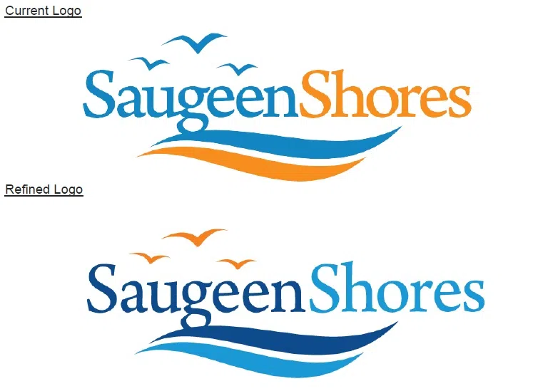
On March 24th, an updated version of the logo was presented that is much the same as the current logo seen around town. It retains the two waves, makes them each a shade of blue, the words “Saugeen Shores” blue and the birds orange. It was approved by council.
During this week’s meeting council was happy with the slightly refined version, with Mayor Charbonneau noting, “I do like the changes you’ve made and I think it’s stayed consistent with the existing logo with some minor refinements that improve it.”
He added, “This is not a radical change, but I think an appropriate change.”
Staff say the blue lettering also keeps the logo up to accessibility standards in term of readability. It will be a gradual implementation rolled out slowly when a new business card or something else with a logo is needed.

